Logo Design | Errington Cheese
20.08.2013
Logo Design case study
Logo design is possibly one of the most difficult design disciplines to do well. The logo must capture the essence of a business, it must be immediately recognisable, unique and extremely flexible in how it can be used.
At Tigerchick we experiment with numerous versions of a logo before the final version is settled upon as a collaboration between ourselves and our client.
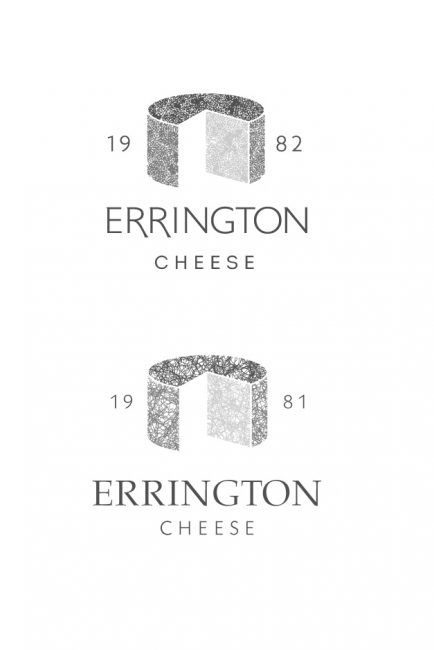
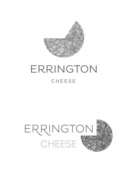
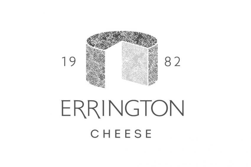
The final version of Errington Cheese's logo can be seen to the right (or above if you're on a smart phone!) but we thought you might be interested in seeing some of the other versions we tested. There were many more than this - these are just a few of the more successful!
Many of Errington's cheeses have beautiful mould patterns that run through them. The challenge we set ourselves was to capture something of this texture but within a very simple shape that immediately suggests cheese.
Errington Cheese is a traditional, artisan cheese maker and we felt it important to strike a balance between that tradition and a modern simplicity. Careful use of typography and custom drawing the "R"s in the final version helped us to achieve this balance as well as using the date the business was established.